
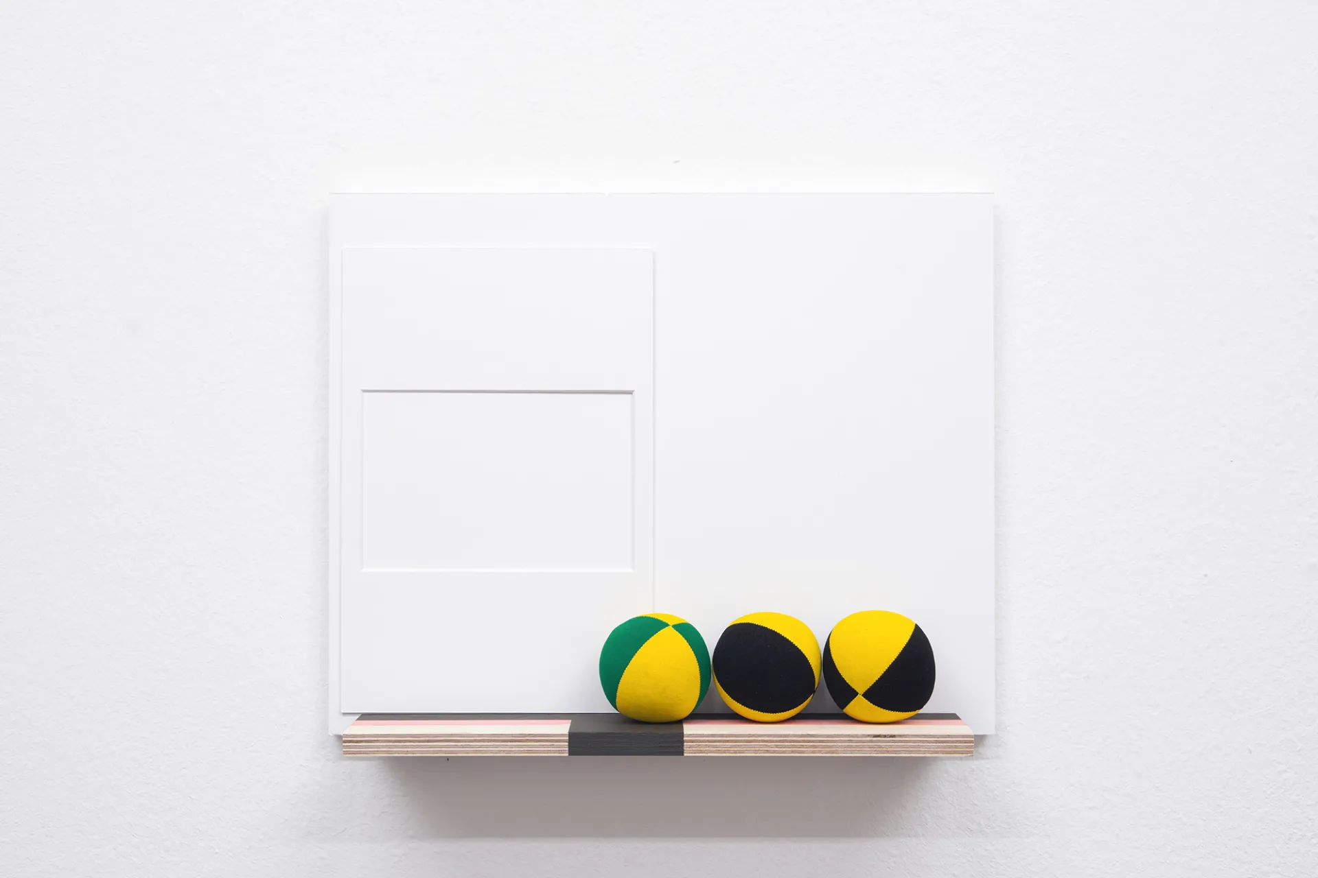
Study Award 2025/26 of the HGB Circle of Friends and Sparkasse Leipzig
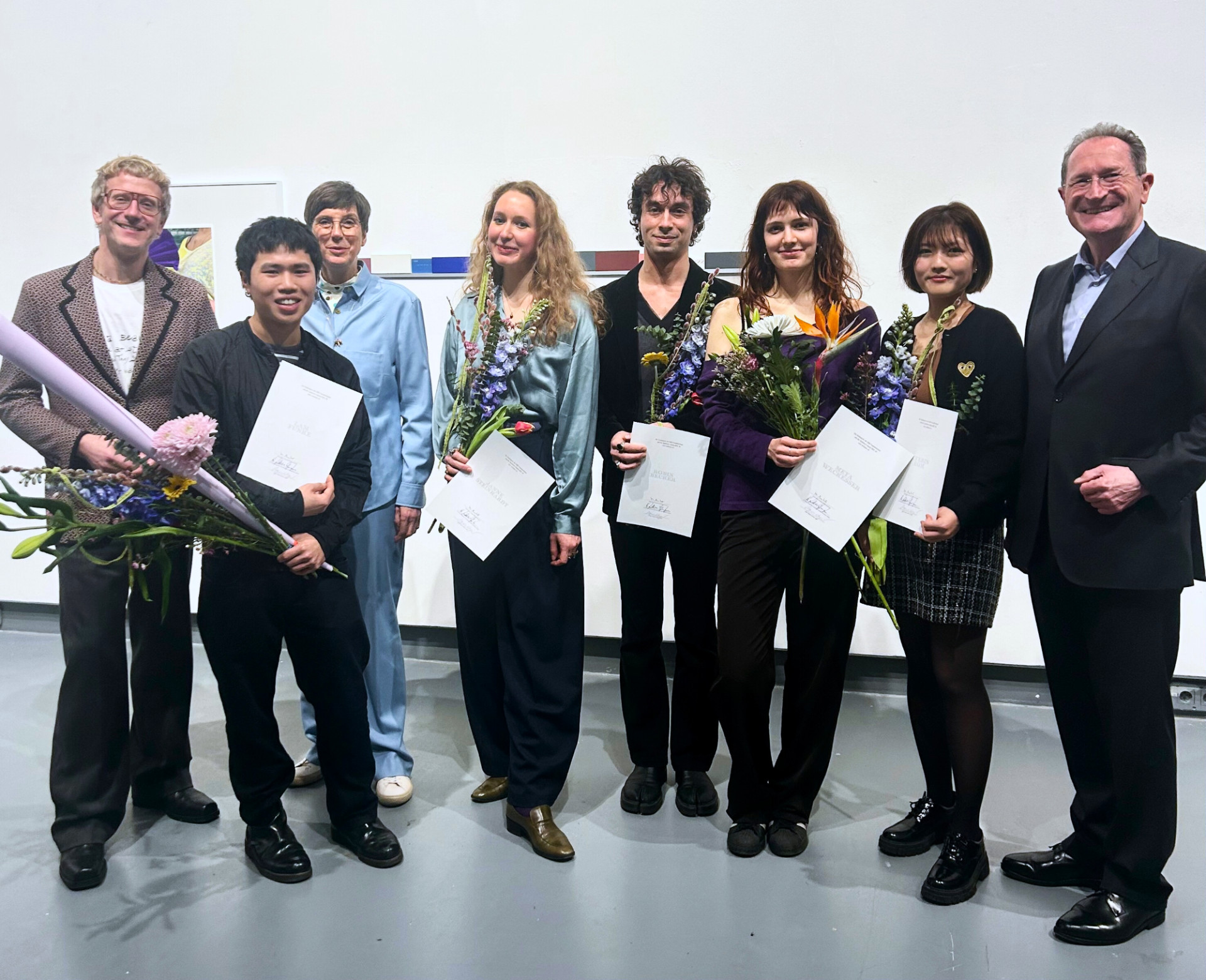
Congratulations to the winners of the HGB Study Award 2025/26:
Robin Becker (Media Art)
Hyerin Eom (Media Art)
Lam Funke (Photography)
Janne Steinhardt (Painting / Printmaking)
Meta Weckeßer (Book design / Graphic design)
This year, the jury selected five works from 98 submissions. The winners will each receive prize money of €2,000. This is the 19th time that the Friends of the HGB and Sparkasse Leipzig have announced the HGB Study Award. Applications were open to HGB students of all disciplines who have not yet registered for their diploma and are not Meister-students.
All award-winning works will be shown in the HGB Gallery from February 12, 2026 in parallel with the HGB Rundgang.
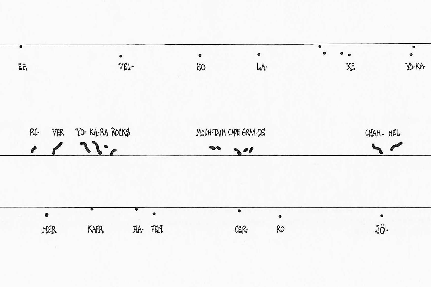
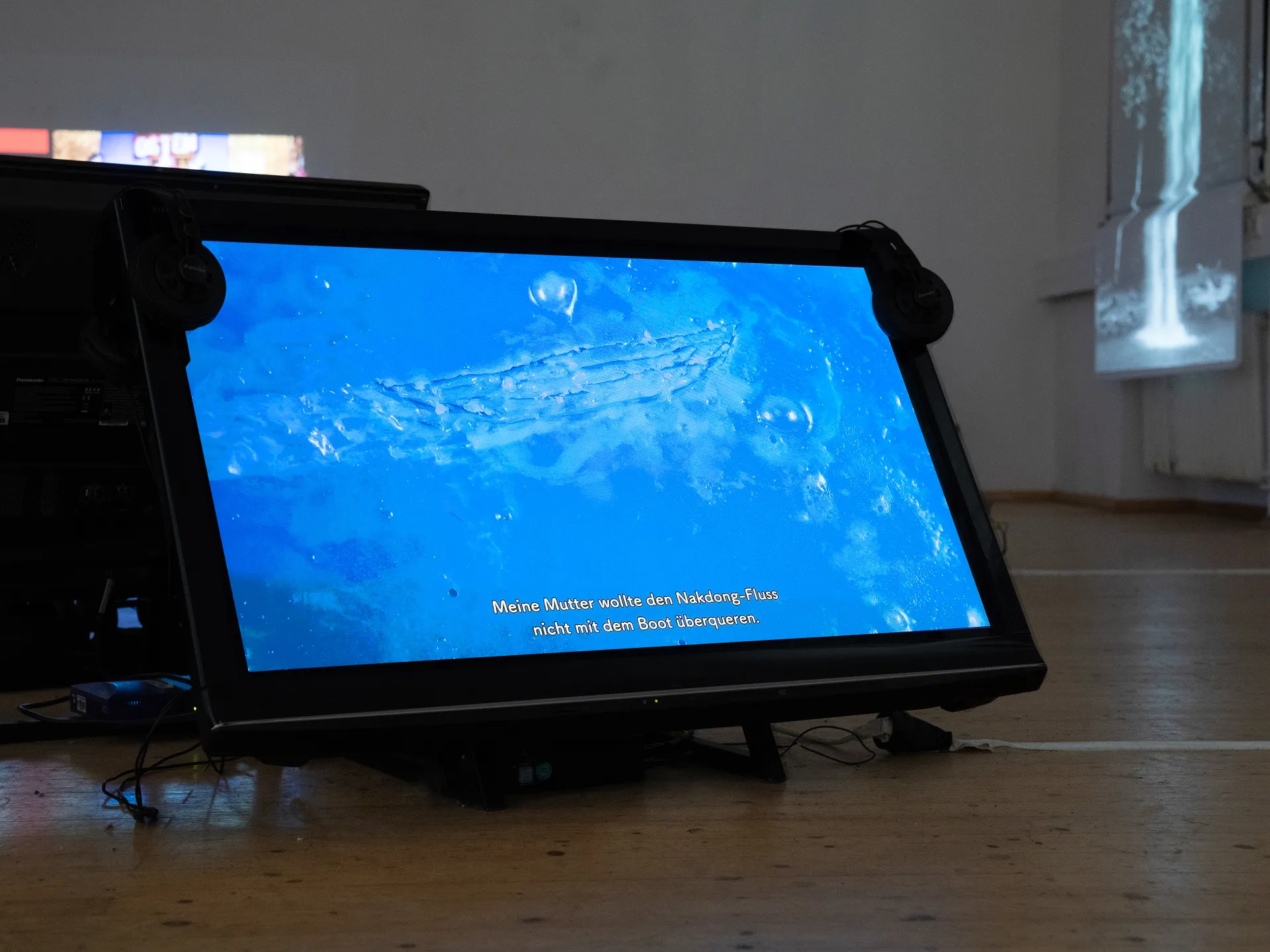
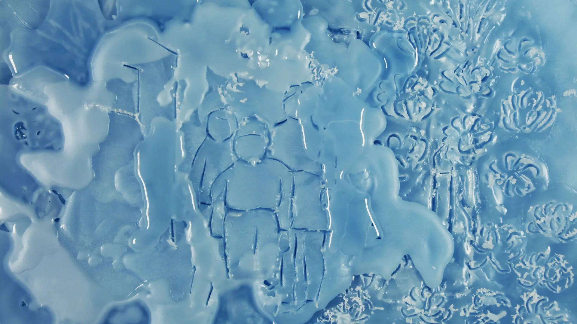
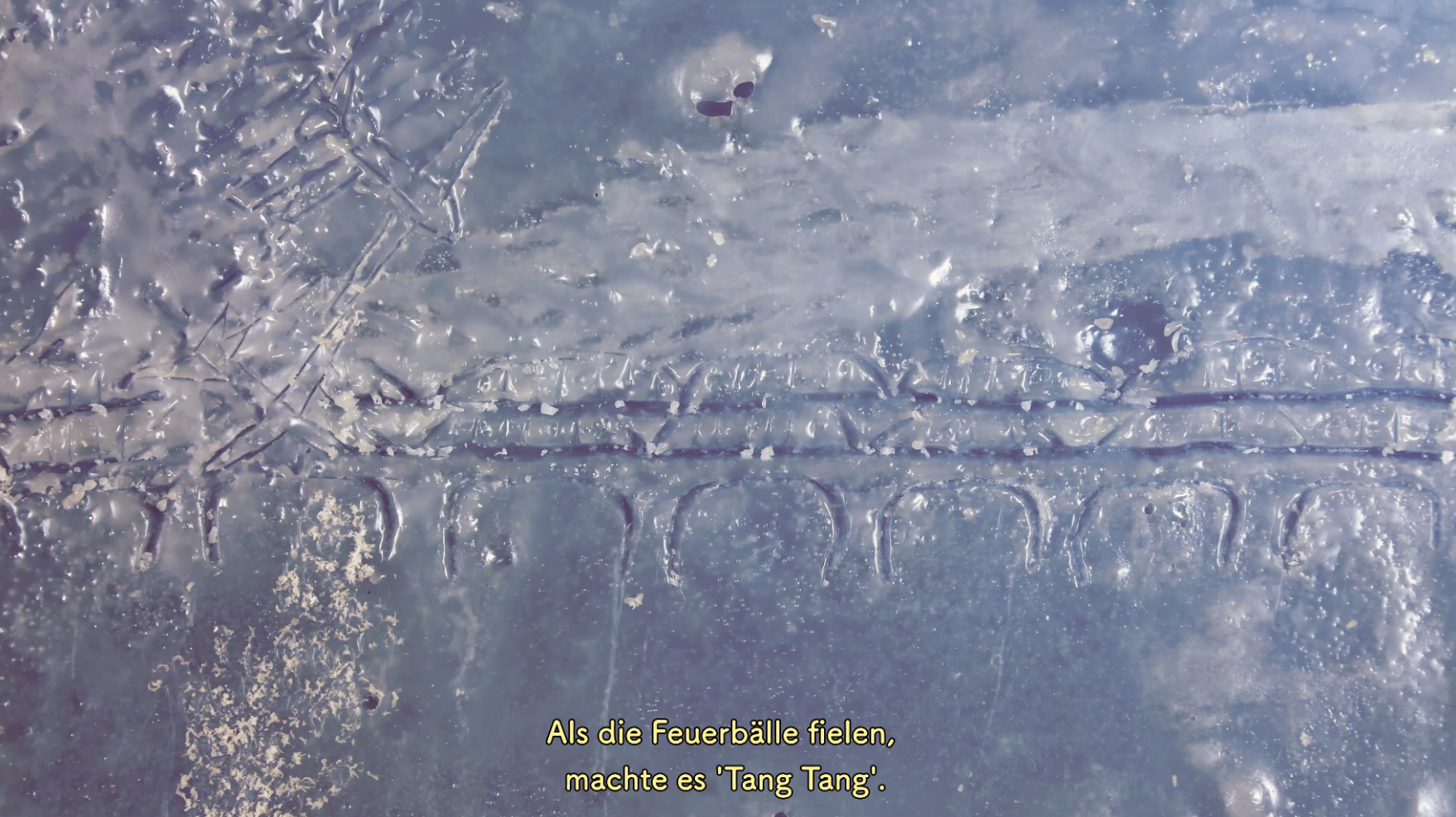


Ten years ago, the grandmother asked her granddaughter to drip hot wax on her aching back. This scene, which was incomprehensible at the time, has stayed deeply in the granddaughter's memory. For the past six years, she has been living in Germany, about 8600 km away from her homeland, South Korea, and feels an inner fear that her elderly grandmother might pass away in the near future. Thus, she embarked on the work of animation to prepare for her grandmother's death. In the animation, she works through the question: “Was her back pain not the pain of her life?” It traces the marks of her life. The wax serves as a catalyst for the memory of something incomprehensible – later, an interview takes place. The memories are drawn, altered, and reconstructed by the granddaughter. They enter her own world of memories and merge with each other.
Hyerin Eom studies in the Expanded cinema class by Clemens von Wedemeyer.
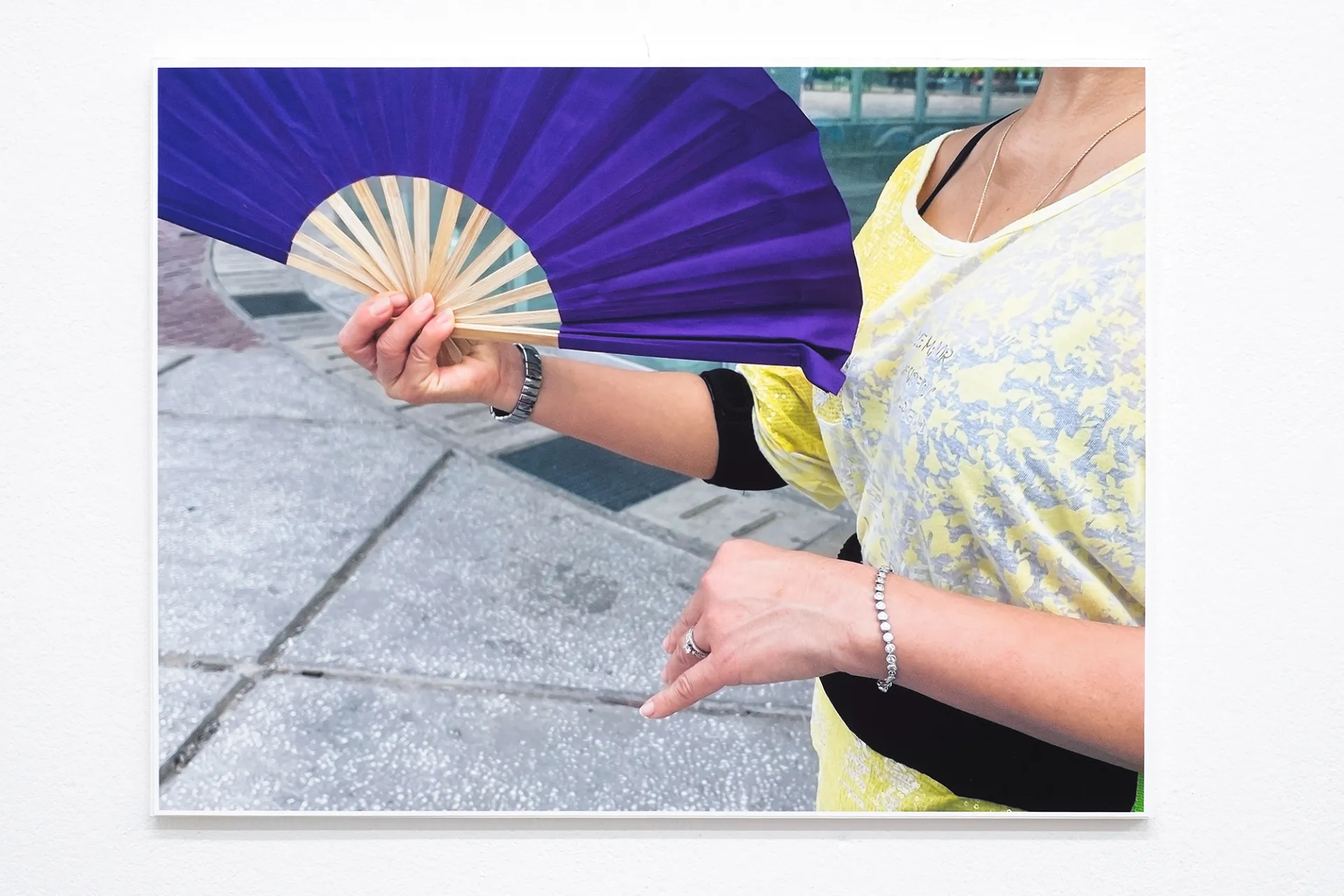
Lam Funke (born in Dessau in 2002, lives in Leipzig) completed his undergraduate studies in book art/graphic design and, since spending time abroad at the Royal Institute of Art in Stockholm, has been studying in Heidi Specker's photography class.
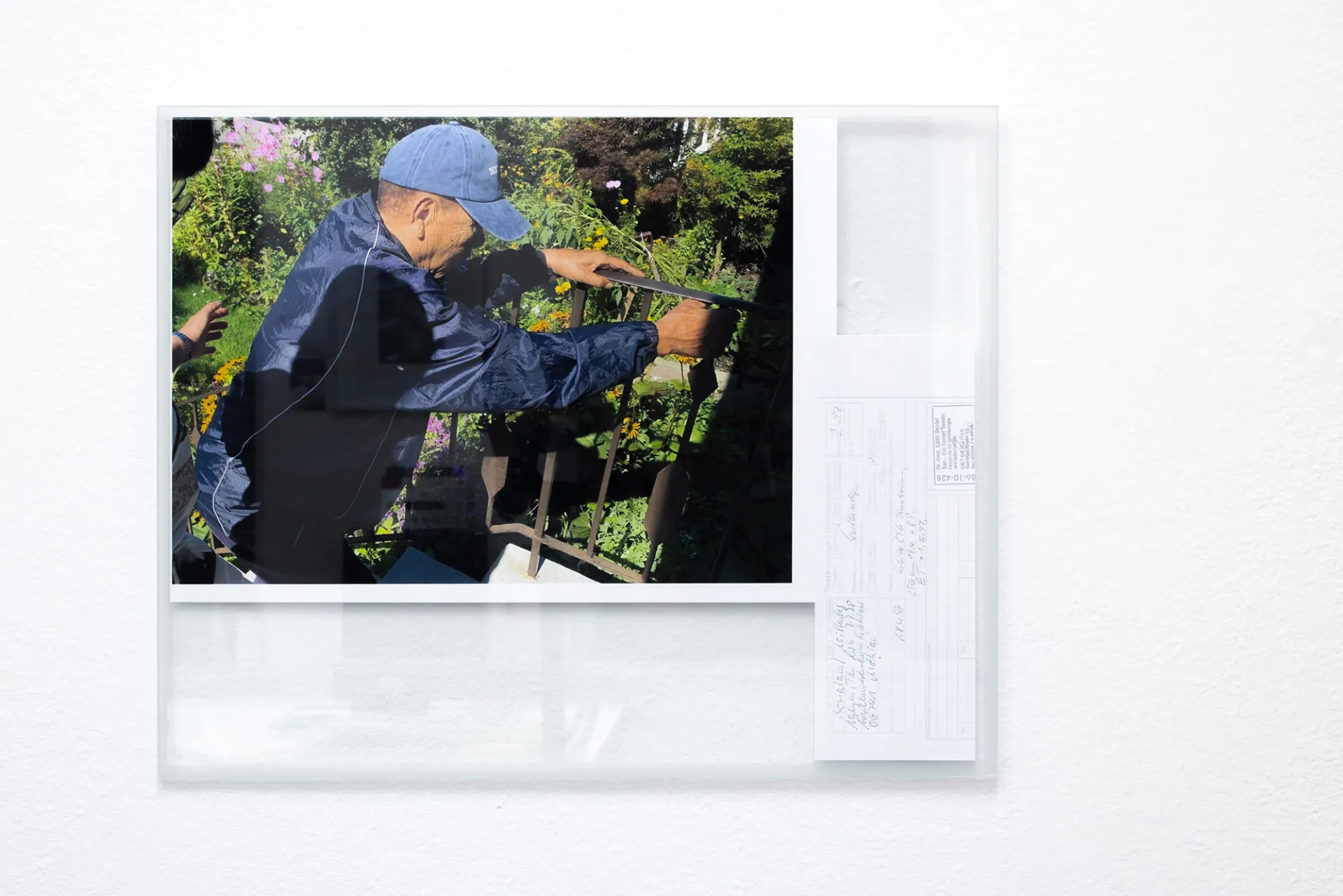
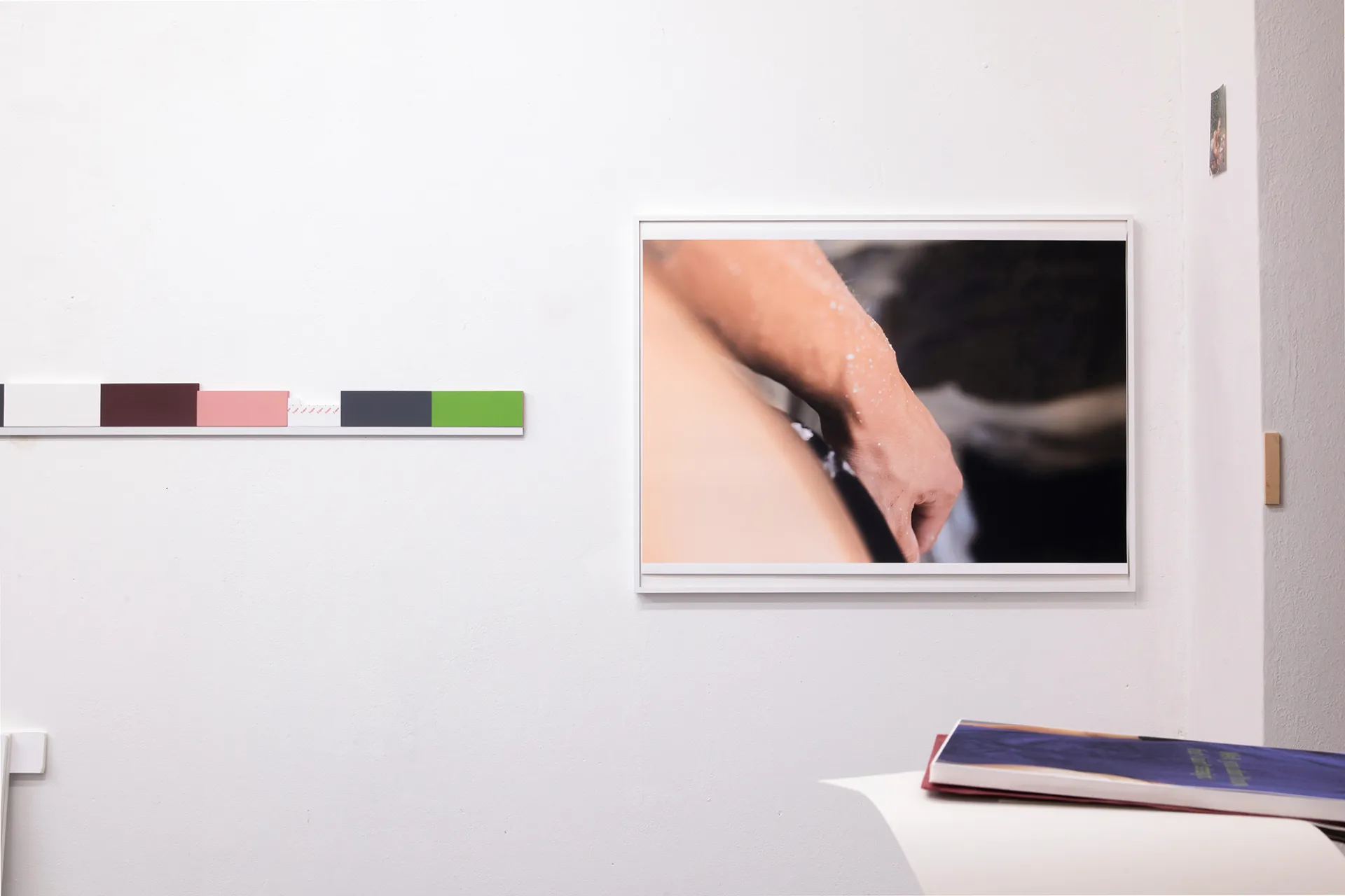
The work group Szenario (Risiko), 2025, is a cross-media work that deals with the effects of his parents' migration experience on his own situation. It follows questions and doubts about the extent to which his identity manifests itself in the course of processes of disenchantment.
This gives rise to fragmentary glimpses en passant: as a view from the bedroom, as a view of his own mother, or as a view of himself. The photographic approach is complemented by installation situations that take abstracted objects from everyday Vietnamese culture as their starting point and rearrange them fragmentarily, among other things in the form of a scale.
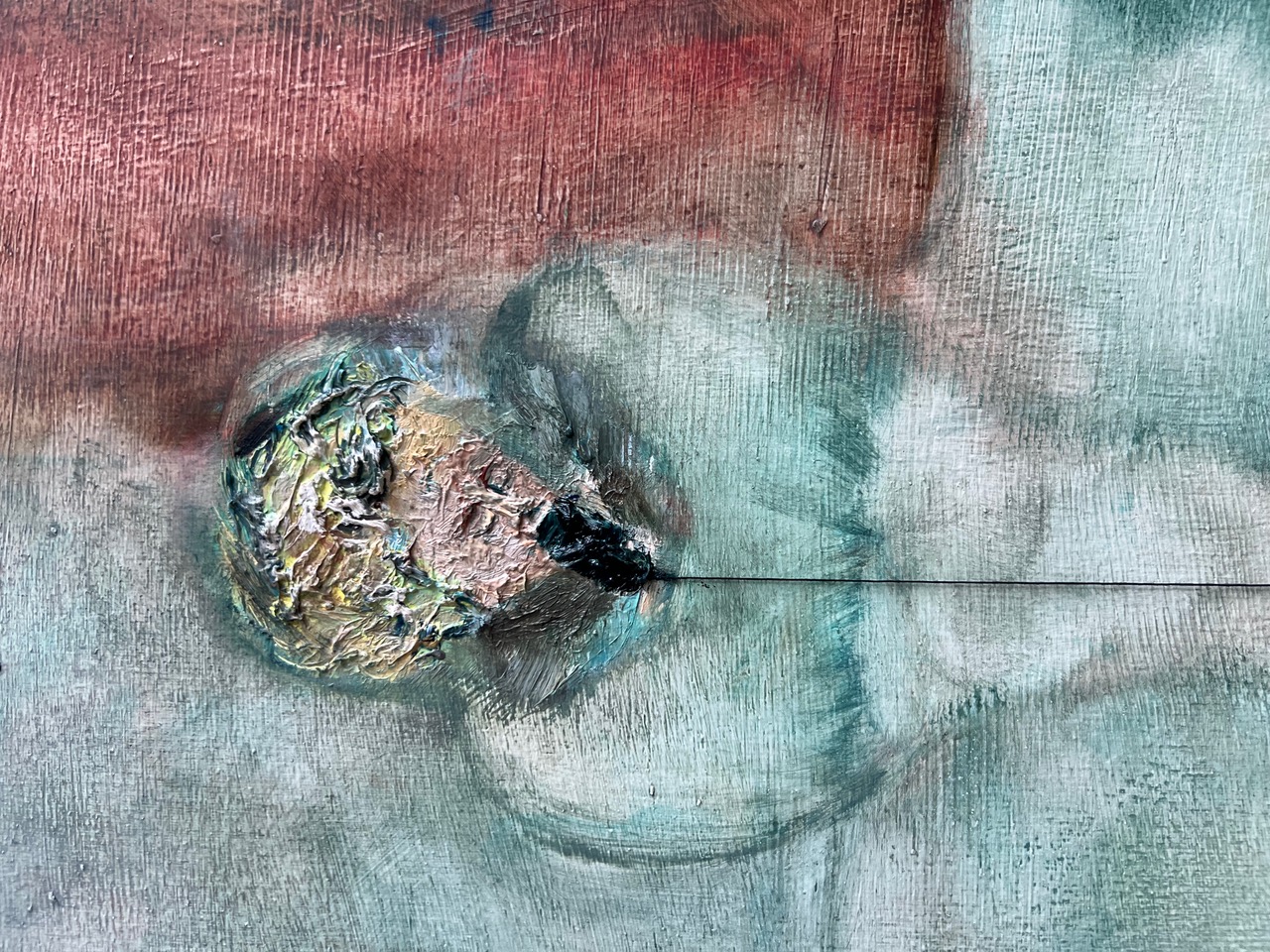
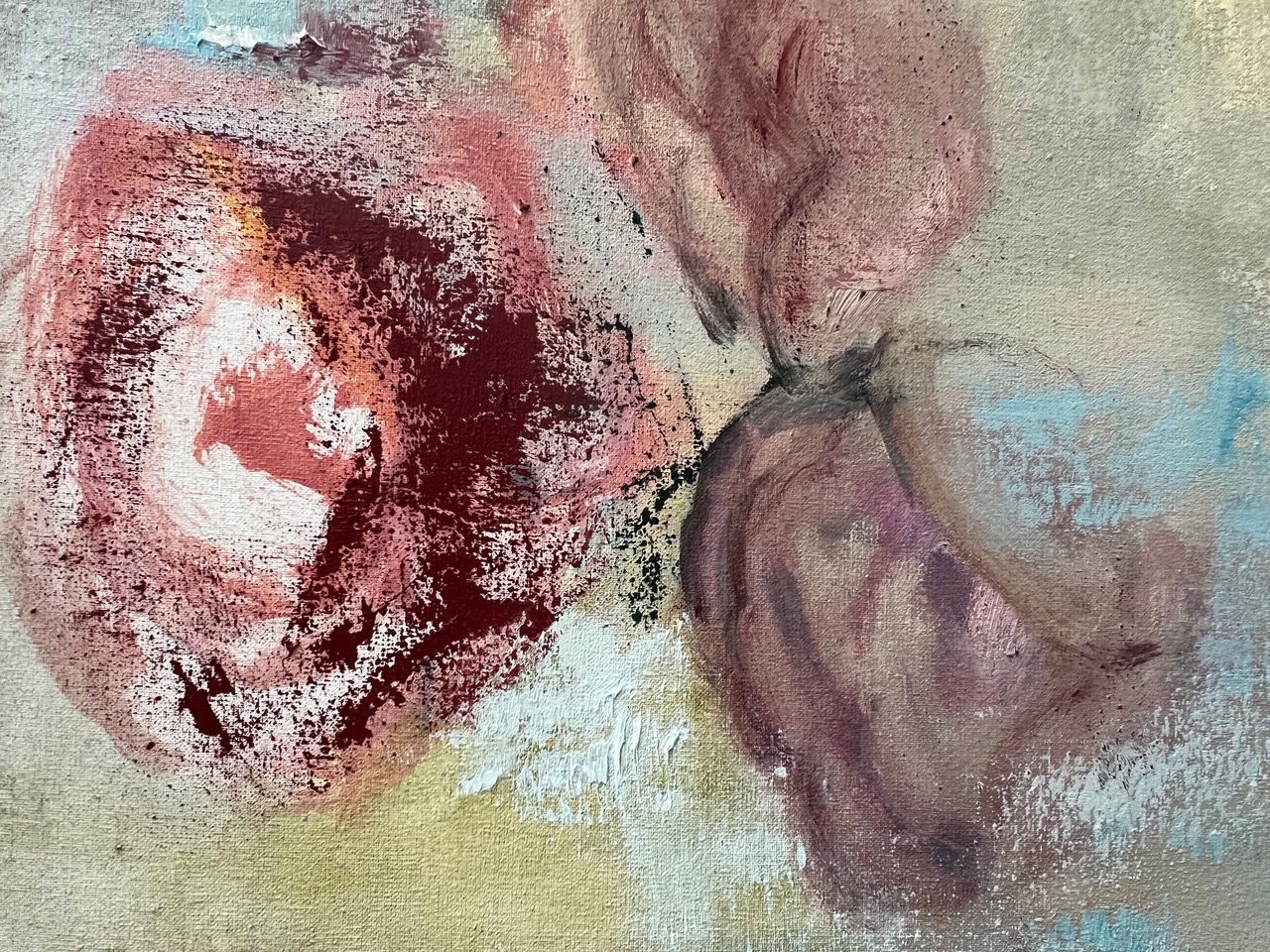
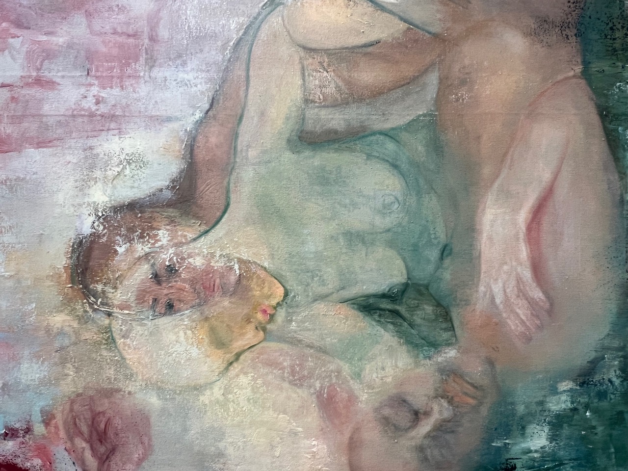
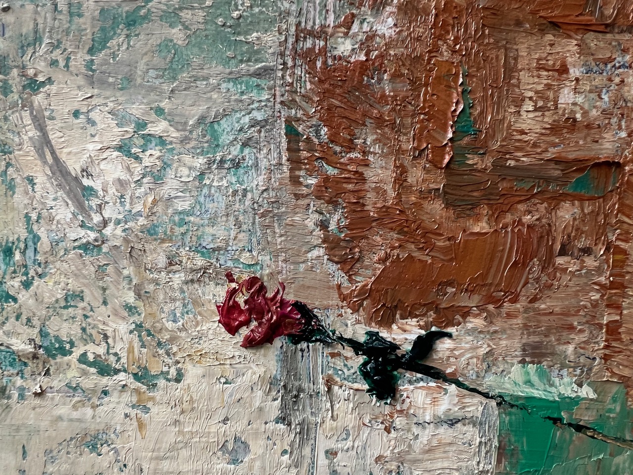
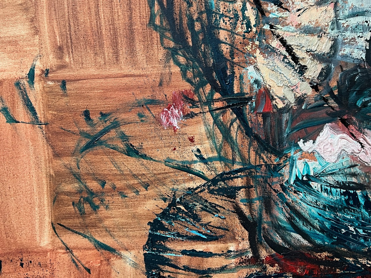
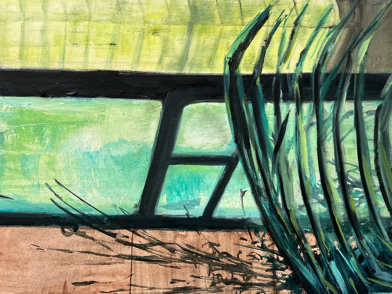
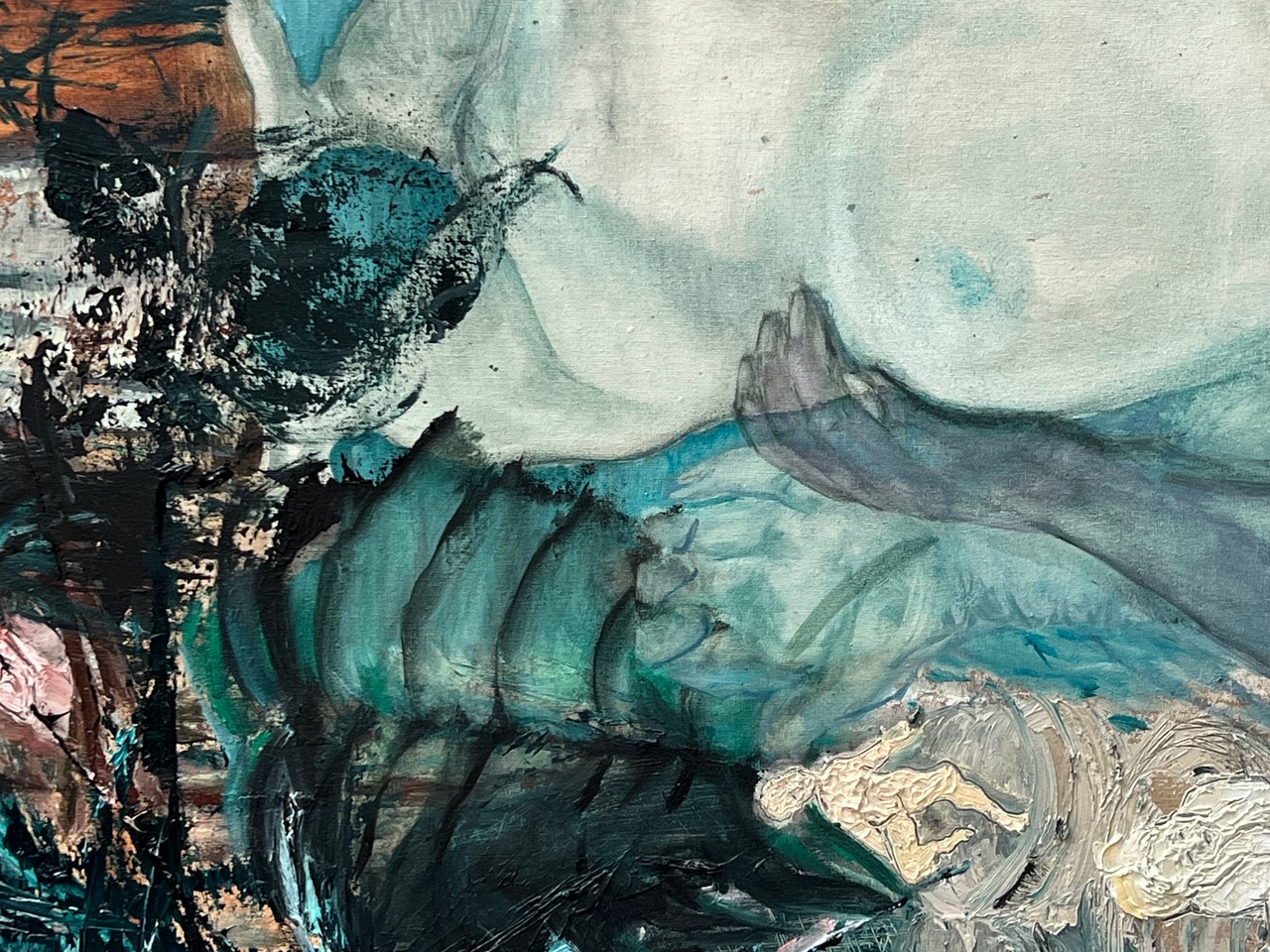
In my painting, I search for a visual language that refuses to be categorized. I approach the archetype of the savage—that figure who lives in the dark rooms of intuition and eludes any clear interpretation. The images arise from a physical act of painting, influenced by Hélène Cixous' écriture féminine—a writing that breathes, weeps, hesitates, overlaps, blurs, resists. An aesthetic experience that does not distinguish between the important and the unimportant, but allows the movements of the inner self as well as those of the outer world.The bodies that appear in my paintings are not figures in the classical sense, but states of being. They shed tears, hold on and let go, they desire and break away, they reveal themselves and remain hidden at the same time. Ambivalence is not a side effect, but a condition: the secret is not what is concealed, but what continually slips away from view.I am interested in that zone between devotion and resistance—the moments when attitude and surrender are intertwined. For me, painting becomes a place of exploration, a space where sensuality does not exist as a surface, but as movement, as a crack, as vulnerability exposed layer by layer. I want to create images that do not explain, but allow us to feel, that do not overcome the unfinished, but breathe within it.The submitted group of works is a preliminary part of an ongoing investigation into female interiority, the voices and gestures that exist outside linguistic discipline. They attempt to carry the wild, the tender, the dark, the exuberant, and the silent in equal measure—without hierarchy. It is painting that does not know where it is going, and that is precisely why it begins to speak.
Janne Steinhardt studies in the Painting and Printmaking class by Michael Riedel.
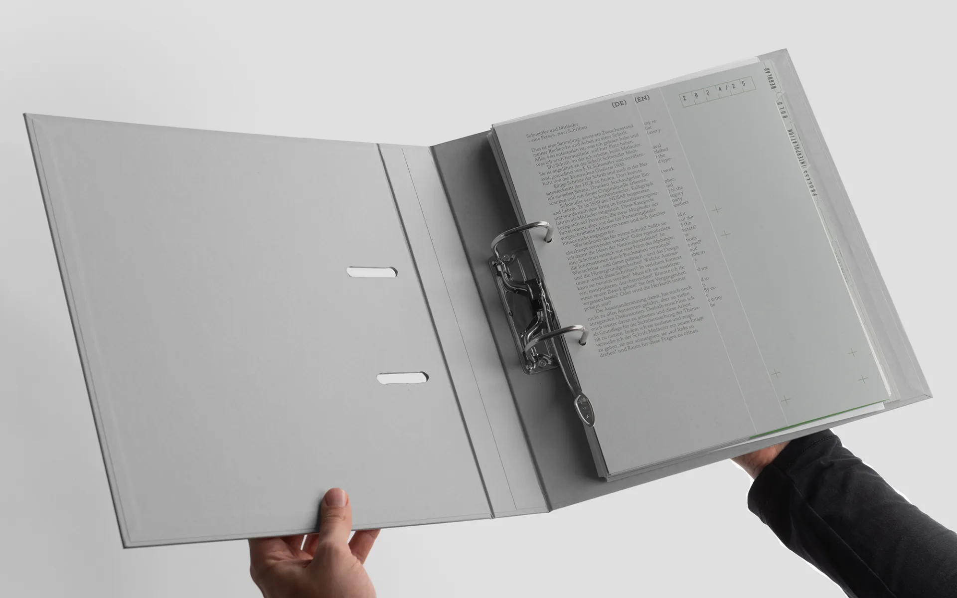
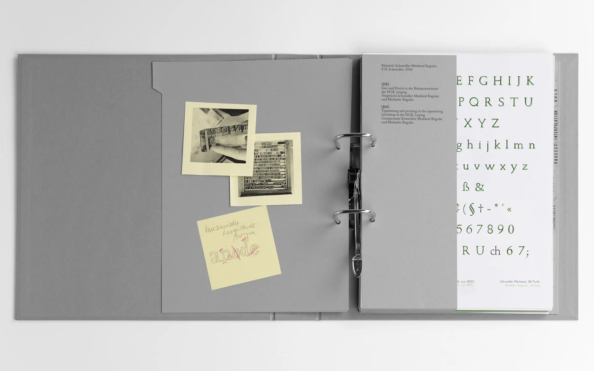
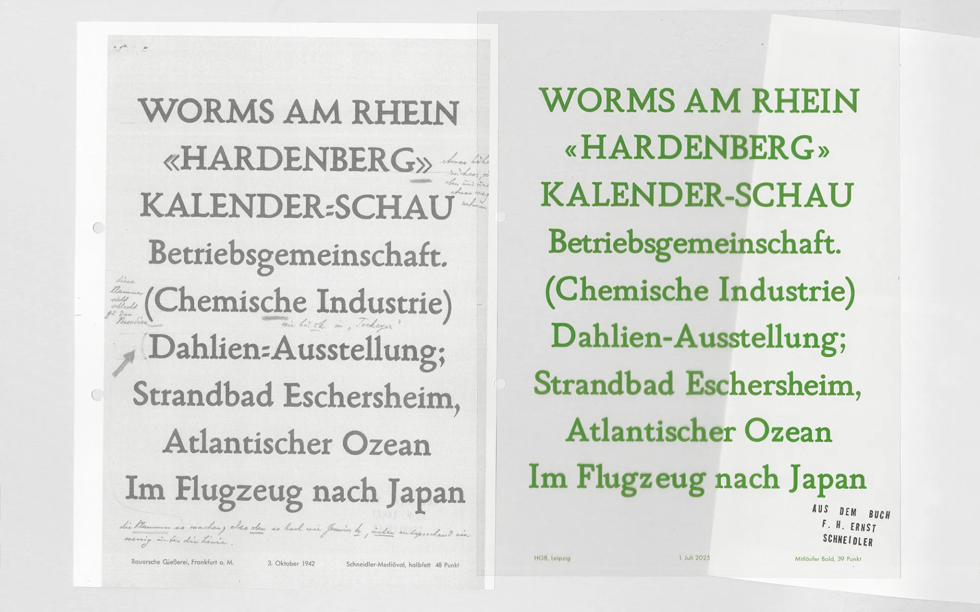
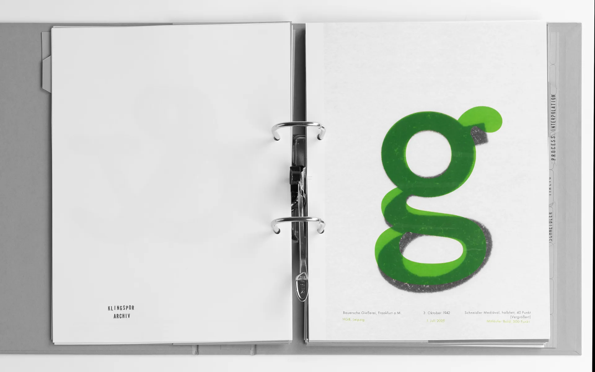
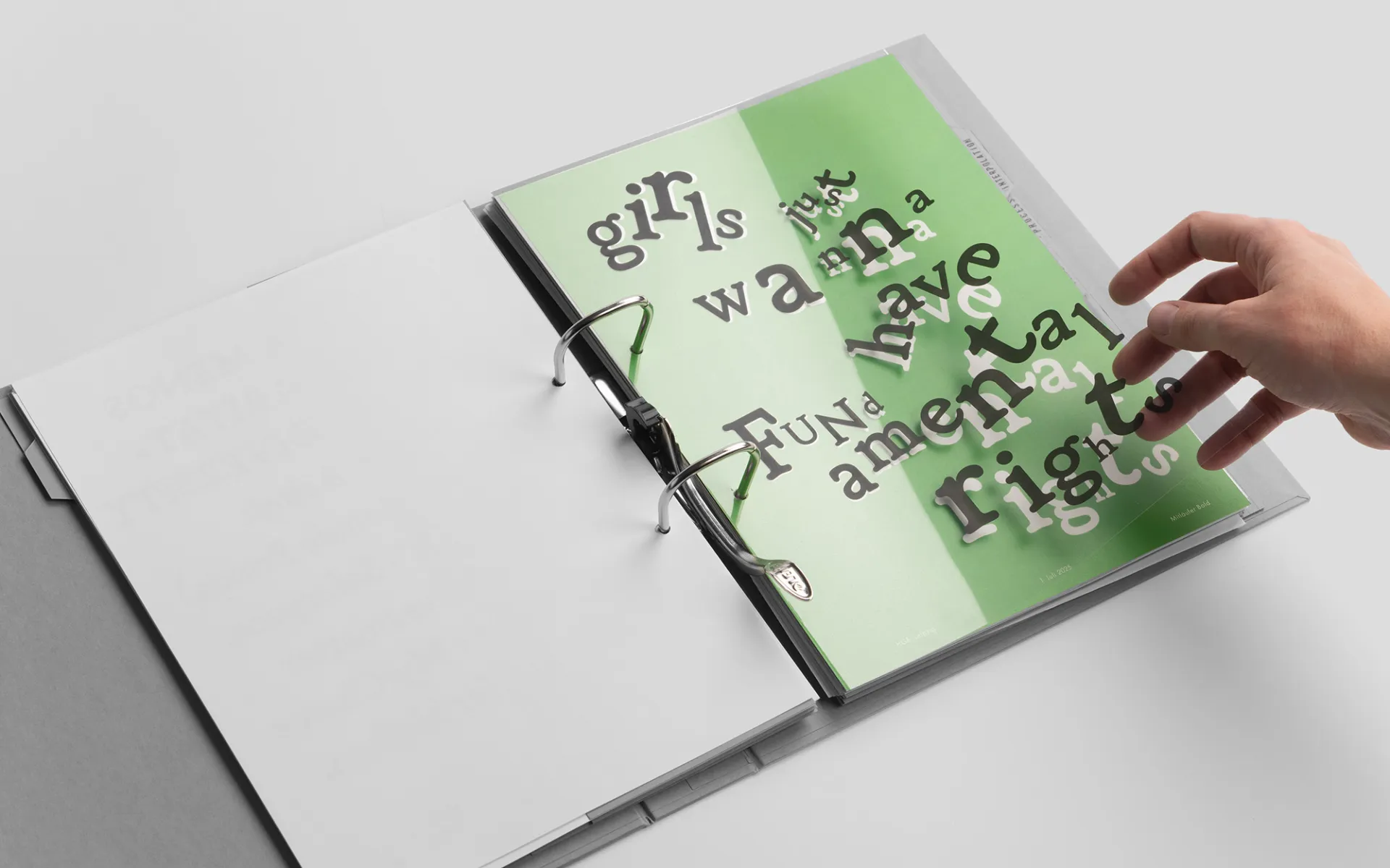
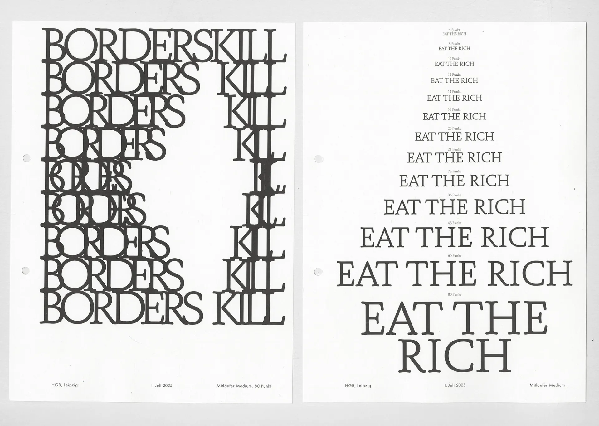
The font I designed is called Mitläufer. It is based on the Schneidler Medieval font, designed by F. H. Schneidler and published by Bauerschen Gießerei in 1936. Some styles of the font can also be found in the HGB's lead typesetting workshop. There, I was able to set and print it myself, scan it in high resolution, and work with this original source. Schneidler was a typeface designer, calligrapher, and teacher. He joined the NSDAP in 1939 and was classified as a follower in the denazification process after the war.
What does that mean for my typeface? Should it even be used? Or am I reproducing the ideas of the National Socialists? Is a typeface simply a form of the alphabet that conveys information through letters?How visible and therefore political are the design and background story? What associations does this font evoke? In what context can it be used? Do I have to modify it, manipulate it, cross it out? Let it forget its past? Can I appropriate it? Or will its origins always be present?
Meta Weckeßer studies Book Design / Graphic Design the Systemdesign class by Maureen Mooren and in the Typedesign class by Ondrej Báchor.